

"Just give us the buttons, y’all." -Wes Davis, The Verge
Note: This article was human written in its entirety. I am pro-AI but do believe in originality and authenticity for long form content.
Introduction
We all see it daily. Many of us, hourly. Flat glass panels with shiny boxes and objects that move across the screen. Maybe some light haptics or physical feedback via a tiny spinning mechanism deep inside your phone. Massive TV-sized screens to replace actual dashboards in electric vehicles. But do we actually prefer this approach to user interface? This article will explore a better way to design a product experience that returns the designer to building things for people that actually feel good and hopefully look good too. While accessibility and universal design is the obvious explanation and fairly prevalent reasoning to designing more physical and tactile interfaces, I’m going a step further here and saying that people are starting to prefer it regardless of ability or disability.
This article will cover early design history into airline and spaceship cockpit design, “faux tactile” or the return of skeuomorphism, real world tangible UX product design, fictional UI (FUI), awesome work being done at MIT, and some brief suggestions for all you creators.
Some brief design history
Let’s do this chronologically. The dawn of interfaces some may argue go back as far as the Caves of Lascaux, in Montignac-Lascaux, France. The paintings in these caves date back to 17,000 to 22,000 years ago. Anthropologists suggest the 900 or so animal drawings represent stories of hunting, mystical rituals to improve future hunts, and even “certain angular or barbed signs of Lascaux may be analysed as ‘weapon" or ‘wounds’… (signs of) dangerous animals. While not interactive, I would say this is one of the first examples of actual interface design.

The Caves of Lascaux - Early hunter informational design
Let’s fast track a few other major stages of informational art through the ages: The Sumerian Cuneiform tablets encoding actual transactions, Chinese Oracle Bones from 1200 BCE (this was an actual interactive system to interpret “divine” messages), Trajan’s Column in Rome (113 CE), Illuminated Manuscripts from the Middle Ages (also all about sacred text, merging images, highly detailed margins and diagrams), Islamic Astrolabes (800-1600 CE, actually interactive mechanical UI to navigate time and space), and everything Leonardo Da Vinci.

The front of the al-Khujandi astrolabe made in 984/985 AD Museum of Islamic Art, Doha, Qatar
Between Leonardo da Vinci and the Industrial Revolution you have amazing design inventions like John Harrison's Marine Chronometer (1761, miniaturized mechanical interfaces to help measure longitude at sea), a ridiculously cool data visualization by Napolean’s civil engineer (see below, from 1812) and his disastrous campaign into Russia), punch cards dating back to roughly 1801 and considered one of the first examples of early computing, to the beautiful transport and train timetables and maps of the 19th century (also below). I actually bought a book of these recently at a model railroad train show 🤓 I took my father to.
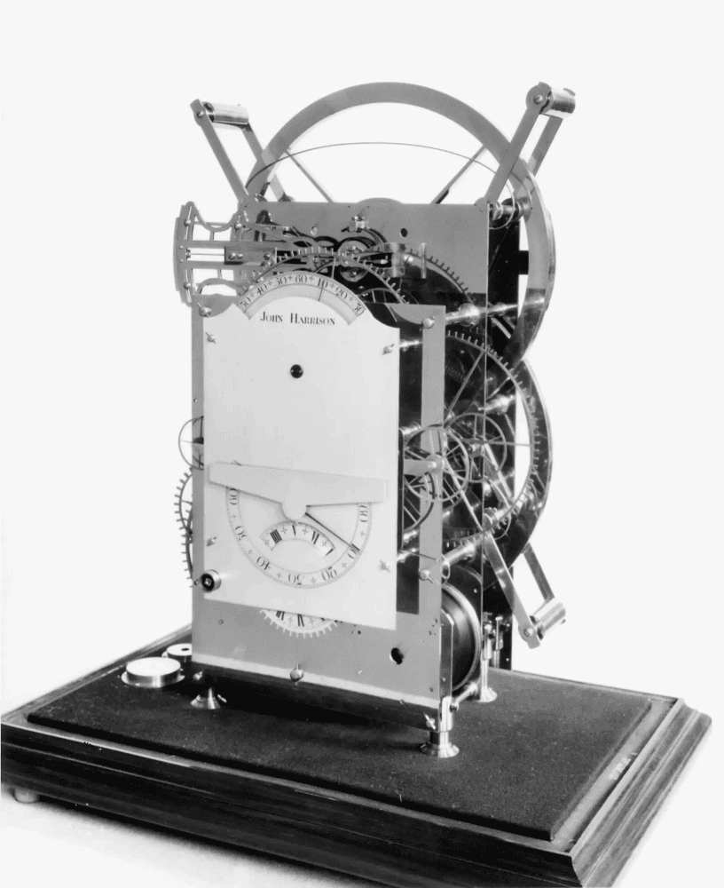
John Harrison's third marine chronometer, 1757, developed a marine chronometer which determined the longitude within 18 geographical miles.

Train timetable books are pretty available at used book stores and train conventions.

Charles Minard's map of Napolean’s Russian campaign of 1812, showing six types of data: troops, distance, temperature, latitude, longitude, direction of travel and location relative to dates. Prolific data visualization professor Edward Tufte called “the best statistical graphic ever drawn.”
A real game changer in human-interface design was the 1840s Telegraph machine which actually used Morse code to send communications. Around the same time Charles Babbage invented the “Difference Engine” which was an early mechanical calculator and some say laid the groundwork for modern computing. By the 1870s, we see the first actual QWERTY keyboard for early typewriters, which were absolutely beautiful, ornate machines (see below) which at the time cost $125, the equivalent of $3,000 today. The reason Christopher Latham Sholes laid out the keys as “QWERTY” is because it forced the typists to slow down and prevent mechanical jamming - paired letters like “TH” and “ST” were spaced out as they’re common in English.
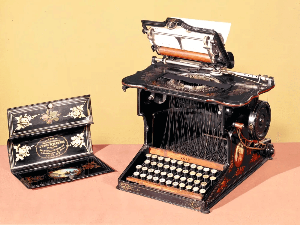
The Sholes and Glidden Type-Writer, also known as the Remington No. 1, the first commercially successful typewriter, introduced in 1873
As was the case with Sholes first instance of QWERTY, we as designers do truly design for intention. We are physical beings and thus where we place human-centered design elements really does matter! And I would argue having some texture and true haptic feedback is a good thing.
The Early Days of Cockpit Design
The 1903 Wright Flyer, the famous Wright Brothers first successful powered aircraft, was a full-body interface - The pilot lay on his belly to reduce drag, shifting his hips side-to-side to make the wings roll. Real Batman type stuff here folks. Check out some of the instruments too.
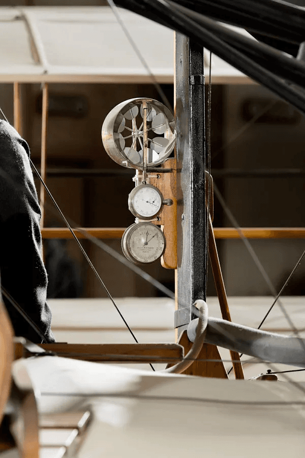
The “anemometer” was also an interface: it measured airspeed.

The elevator control lever allowed the pilot to change the plane’s pitch.
The era of WWI into the 1930s brought further evolution in flight instruments like compasses, altimeters, and better airspeed indicators with the obvious heavier, but more reliable full bodied planes popular in that era. These instruments provided critical feedback for pilots while also starting to leverage weapon systems. Check out the James Bond-esque cockpit of the British Sopwith Camel:

The British Sopwith Camel for WWI had an absolutely beautiful cockpit. Look at that typography and mix of painted metal and leather!
Moving into WWII and beyond, cockpit design continued to evolve but still very much at the mechanical level. Autopilot systems were being introduced as early as 1940, reducing pilot workload, mirroring even modern automation processes that handle routine tasks. Radar emerged with beautiful data visualization, giving both pilots and their intelligence teams actionable insights - Principles key to modern dashboards and analytics.
Around the same time, a Vannevar Bush in 1945 created a concept for “a desk… primarily the piece of furniture at which he works. On the top are slanting translucent screens… There is a keyboard, and sets of buttons and levers. Otherwise it looks like an ordinary desk.” He referred to such a device as a “sort of mechanized private file and library,” calling it a “Memex.” Read Bush’s description of the Memex here.
Enter modern and near-future cockpit design
I keep coming back to cockpit design because it's a masterclass in making complex systems usable — combining dozens of controls and real-time instruments into an environment where every action, every piece of feedback, directly supports safety, mission success, and fast decision-making.
I first started digging into cockpit design when working on a stock options trading dashboard that I co-designed with a super talented designer named Enrique Sallent. While Enrique made sense of the complexities of options trading, a highly lucrative but also risky form of trading, I was tasked with the high-fidelity UI work on the platform. Realizing we were giving these advanced traders the power to basically turn dials to place hypothetical trades before “selling the farm,” I began digging into truly tactile interfaces and use cases like airplane pilots. Granted, this was almost a decade ago, but the research and curiosity is still very relevant.

Left: Digital UI that I designed for TD Ameritrade, Right Inspiration from pre-digital audio interfaces like the NAD C 3050 amp (top), Technics SU-7300(bottom right), & Rackmount 529 Waveform Monitor (bottom left).
“Efficient designs, resulting in the minimum required recall of memorized action sequences, for the access, format, and insert actions are defined based on the structure and style of the user-interface.”
Of the three biggest commercial airline manufacturers, Airbus, I’ve found to have the most legible, user friendly informational sites on cockpit design. I’ve been able to poke around their cockpits and read more about their design decisions. There's always the 396-page government PDFs like the “Human Factors Considerations in the Design and Evaluation of Flight Deck Displays and Controls” which looks interesting, I just don’t have the time or LLM tokens to parse through at the moment. A much more approachable paper on the topic is from NASA, “DESIGNING USER-INTERFACES FOR THE COCKPIT.” In it, the author states “Efficient designs, resulting in the minimum required recall of memorized action sequences, for the access, format, and insert actions are defined based on the structure and style of the user-interface.”
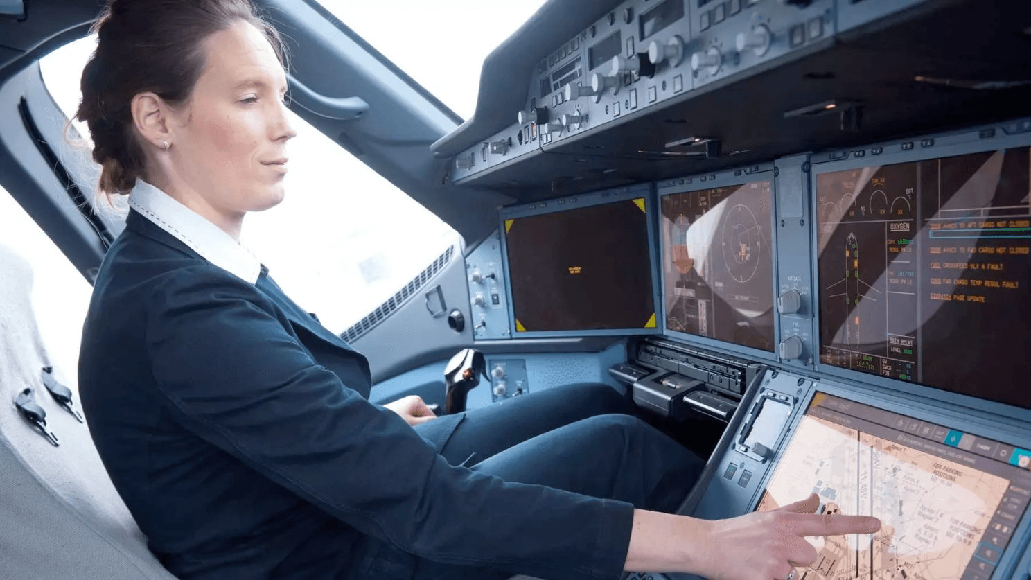
Airbus published “5 reasons pilots love flying the A350” and their reason #1 is “Designed by pilots for pilots.” Alongside their six identical liquid crystal displays which connect to the cloud and do all sorts of magical, digital work for the pilot, co-pilot and ground control, they still kept plenty of the physical interface required for them to do their job. In the images below, the pilots and design team have chosen to keep the flight control keypad, the small black screen to the right of the large navigational display being a display controller to actually change the map view (think pinch-and-zoom but tactile), and apparently physical buttons for redundancy for quick tactile access in turbulent conditions, screen shutdown, smoke, etc. This is so similar to the Work Louder’s Creator Micro USB keyboards I talk about later in the article.
What about all those fonts?
Another quick aside many designers will rejoice over: In 2017, Wired published an article titled “Why typography is a matter of life and death in aircraft piloting systems,” in which an ex-Royal Air Force (RAF, UK’s air force) talks about the importance of visual languages and typefaces. In it, an author of a separate paper writes “the large number of available digital fonts, as well as the published guidelines should not lead us to consider that legibility is no longer an issue of concern. On the contrary, a special effort should be made to prove the safety, usability and performance of this software component. The creation of a numeric typeface necessarily involves highly specialised knowledge in the field of design and typography. The critical area of use of these fonts also requires the contribution of particularly rigorous evaluation methodologies of the kind used by experimental sciences.”
Airbus pilots were also the designers

Mix of tangible UI and digital screens
The A220 Cockpit
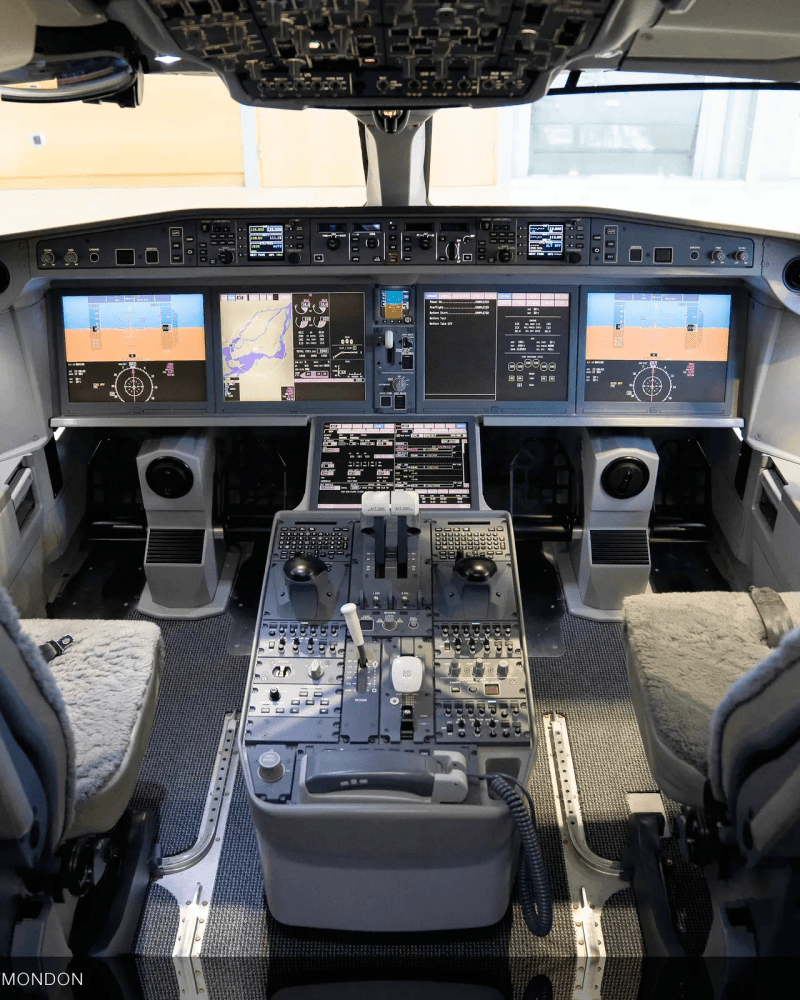
Are those sheepskin seats? 🫣
The A350
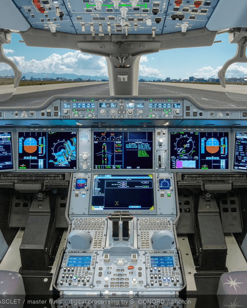
Psssh I could fly that.
It really is some truly inspiring design work and I can only guess engineers designed all of this (my father was actually an electrical engineer for McDonnell Douglas, now acquired by Boeing, working on their jet navigation systems during the Cold War).
Enter NASA and their work on Apollo and Orion
If we look at commercial airliners as a benchmark for complex interfaces, we may need to step back and upwards… Check out NASA’s work on flight and navigation control going into space.
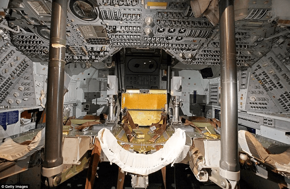
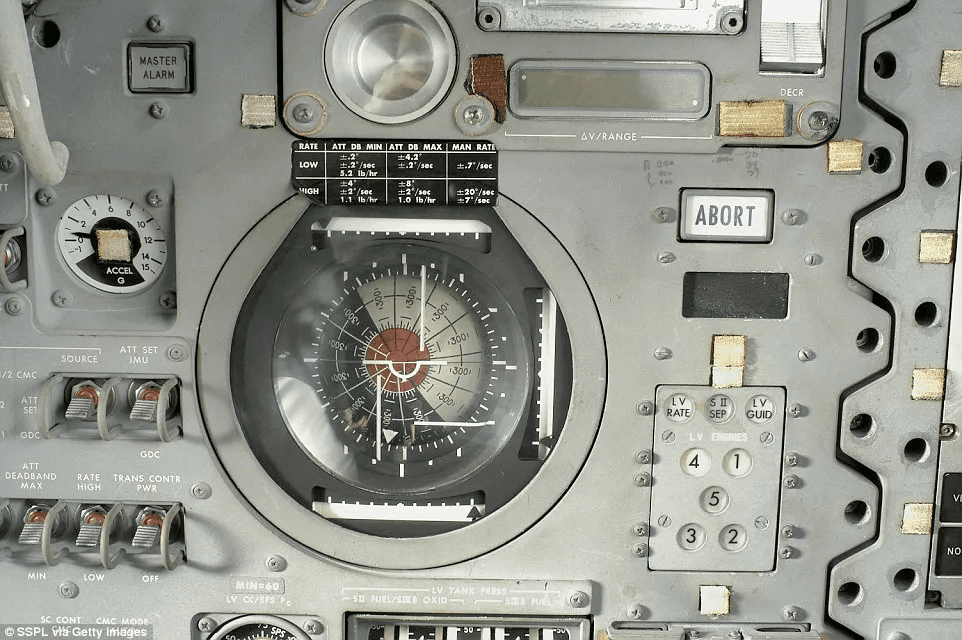
The 1969 Apollo 10 command module was an absolute hornets nest of buttons, dials, and other physical interfaces. Imagine flying into space with that all around you. I’m all for tactile UI, but holy smokes, astronauts are on another level, pun intended.
In 1969, this was the closest thing to a touch screen.
In 2016 as Nasa and Boeing evolved their shuttles into the Orion and Discovery, they provided the Daily Mail access to much of their control setups, highlighting the evolution of the spaceships’ cockpit design.

I don't think this dude's in space, but maybe I'm wrong.
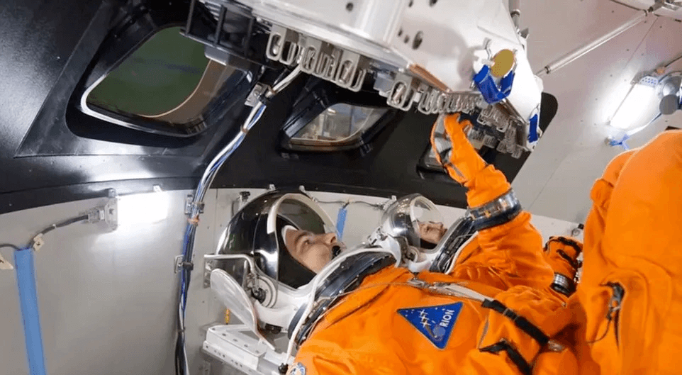
I'm honestly curious how Nasa tests the gloves and their ability to hit buttons inside the spaceships.
“The goal was to build a cockpit user interface – a dashboard – that would allow the crew to control the spacecraft on these deep space missions,” said DR. Lee Morin, astronaut and lead crew interface for Orion. They employed the six flat screen monitors mentioned earlier in the Airbus portion, which combined with plenty of the tactile switches, greatly increased usability. Morin even brought his 9-year old daughter into the project: “He explained how it worked and asked if she was able to turn it on,” Morin recalled. “She did it right away. That was the acid test.” Via DesignNews
Morin even brought his 9-year old daughter into the project: “He explained how it worked and asked if she was able to turn it on,” Morin recalled. “She did it right away. That was the acid test.”
Continued evolution of cockpit design
Honeywell is actively prototyping updates to the cockpit through a project called the Anthem in which their touchscreen interfaces, married with the required and helpful tactile components, “takes a lot of busywork and stress off pilot’s shoulders so they can focus on what they do best - fly the aircraft safely and efficiently.” Advanced UX Designer at Honeywell says “we used rapid prototyping to create low-fidelity, virtual and 3D-printed prototypes so pilots could compare multiple options and give us their feedback.”

Honeywell's work on the Anthem
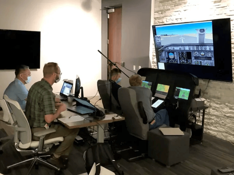
UX designers testing solutions with real pilots
Present, cutting edge tactile UX/UI
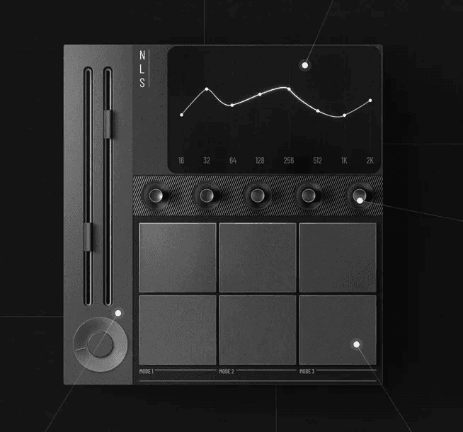
What I started referring to as the “now future” of tactile UI, it’s super interesting to see how physical interfaces are now overlapping a heavily digital, touch-heavy experience. Some really great examples of products that are actually “in the wild” now as people embrace this touch-and-grab or touch-and-tickle UI approach:
1. Work Louder’s micro keyboards which they market as “make work feel like play” and more language about productivity and efficiency. As a professional designer of 20 years, I can’t even calculate how much time I’ve saved with keyboard shortcuts… I need to get one of these and only currently have something similar for MMO gaming. I believe the inception of such keyboard shortcut devices is derived from video production professionals.

Work Louder’s Creator Micro 2 for Framer

Work Louder’s Figma Creator Micro. Jury's still out on the usefulness of this device.
2. Car dashboards: This was the second inspiration for me writing this piece… The ridiculous lack of physical buttons in my 2023 Volkswagen Touareg. I love the vehicle but the prevalence of this major touch screen, not even nearly as guilty as most Teslas, but when you’re driving, especially at night, I want to feel the buttons! People are getting fed up with all the useless tech in their cars especially touch screens. “More people are choosing not to use their car’s native infotainment controls. Only 56 percent of owners prefer to use their vehicle’s built-in system to play audio, down from 70 percent in 2020," according to the JD Power study.
More people are choosing not to use their car’s native infotainment controls. Only 56 percent of owners prefer to use their vehicle’s built-in system to play audio, down from 70 percent in 2020.
Volkswagen in fact is starting to reintroduce more physical buttons, partially due to the EU’s New Car Assessment Program (NCAP) requiring vehicles to include more tactile controls for safety purposes, primarily tied to driver feedback. Sure, there’s an argument that all cars will eventually be autonomous, but I for one plan on driving until I’m well into my 100s.

The newer 2024 & 2025 VW HUDs include both physical and digital
While the touch screen is still very prevalent to allow for plenty of beautiful digital UI elements, the buttons on the bottom of the screen are very much physical. Our 2023 VW uses a touch slider to change temperature and it drives. me. crazy.
Hyundai - "Sometimes buttons are just better"
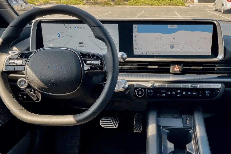
Hyndai Ioniq 6 dashboard and console
Hyundai is another major car manufacturer moving towards a hybrid approach to UI. And while some people are skeptical about physical buttons especially as cars go more autonomous, driving completely out of a human's hands, there's plenty of reason to assume we'll still be the one behind the wheel at least for part of the ride. As Verge author Wes Davis says, "will it be less frustrating to yell at an LLM over the noise of screaming kids, construction, cruddy roads, or rain? Color me skeptical. Just give us the buttons, y’all."
"Just give us the buttons, y’all."
Out of China, we have the Xiaomi SU7 which totes a magnetically attached "docking unit," using piano-style keys that snap on to the screen.

The Xiamoi SU7's docking unit. I want one.

While poorly received by the general public, Jaguar's rebrand included some stunning interactive panel work and industrial design.
Faux Tactile - Digital only
I’m loving the design industry’s return to skeuomorphism and hyper realism right now. Steve Jobs and even Jony Ives for that matter (have you seen his new company is built entirely around a clothing button? Quite tactile!) would probably be very happy to see some of the things people are designing with a clear three dimensionality to objects, buttons, and entire interfaces. Yes, some of it is trendy, X is full of showboats on how easily people can do this in Figma now (myself included), but a lot of it is really beautiful work. Check out some examples:
Mik Skuza - Polish designer, I reference his work regularly for inspiration.

Mik Skuza
Mik Skuza

Mik Skuza
Andrey Chernyshuk - Prolific SaaS UI designer
Tyrone C. - Tyrone is a web designer and Framer developer. If I remember correctly, he just recently within the last couple years got into 3d modeling using Figma of all tools to do all these. He’s even landed jobs as a consultant with Porsche.

Studio 28K
A viral post last summer in the design community was that of Studio 28K, who built a blockchain based streaming platform called DumplingFM which was inspired by record stacks. Everything from the smooth, easing in-and-out motion details to subtle sound effects give the experience an almost real tactile UI.

DumplingFM's hyper realistic but minimalist UI for a streaming music service
Severance (Apple TV)
Not exactly sure what alternate universe or timeline Severance takes place in nor am I sold on the usability of the consoles the characters are hammering away at, but wow is it a beautiful piece of cinematography. Especially the tactile devices upon which they’re so entrenched. Please reach out if you are the designers or know who they are!
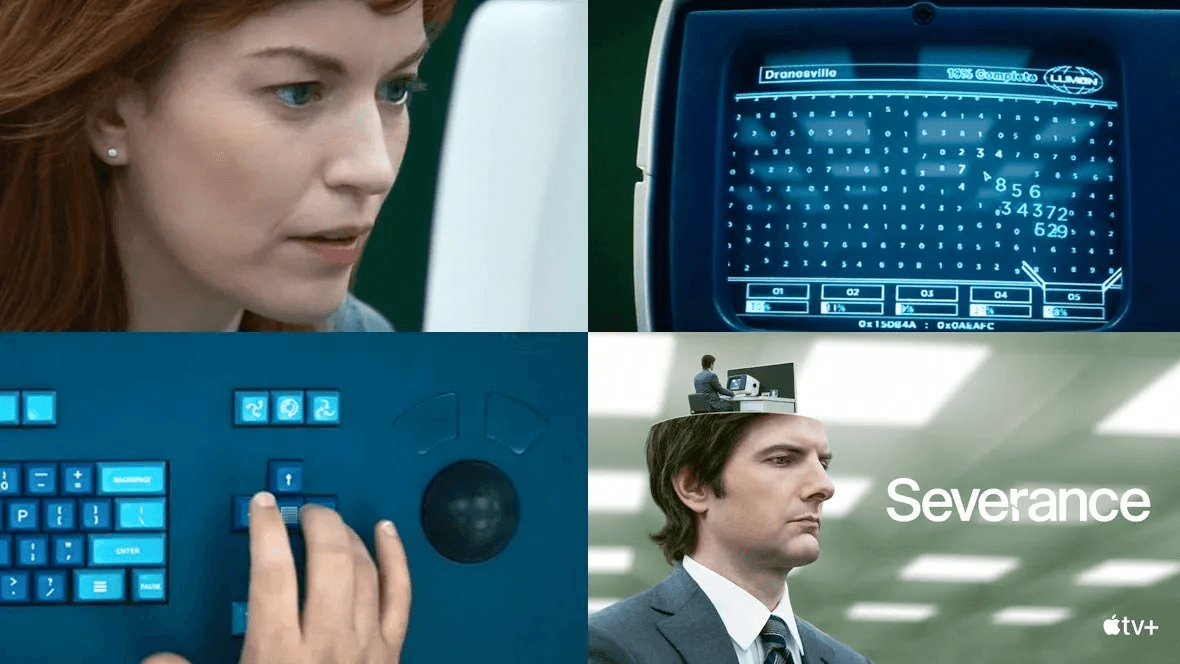
Innie or outtie?
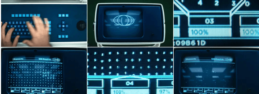
Data entry or something else at Lumon?
Product Design - The real, physical tactile UX work
I have the utmost respect and borderline jealousy for the design technologists I encountered at Amazon and Oracle and I can only imagine the prototypes being cooked up on a regular basis at places like Apple, Samsung, Ford, etc. While I code, am an expert in digital product development, and UX/UI, consider myself a UX engineer, I am not an industrial designer. These are the elite who pride themselves on knowing true physical product development to solve a unique customer problem and who have the skill and ability to follow through.
Industrial designers and design technologists are starting to re-introduce more tactile UI. The newest iPhone 16 Pro (I’m already dreading how outdated this article will become in the next year or two) released with the new Camera Control Button, something previously reserved for touchscreen only or arguably better Android devices. The 15 Pro introduced the Action button allowing customizable tasks and actions.

The iPhone 16 Pro’s Camera Control - A mix of physical and touchscreen digital

The Amazon Echo Studio - Almost entirely driven by conversational UI, I still regularly use the volume buttons.
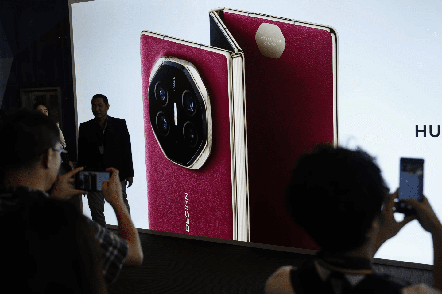
Huawei's upcoming tri-foldable phone. Tangible lies in the ability to fold it and also use its touchscreen across three panels. Curious what other buttons are also included.
Futuristic Tactile UI & FUI
Aside from my annoyances with the prevalence of touchscreen only in our VW, I’ve been meaning to write this article also partially due to my love and passion for “FUI” or Fictional User Interface. While a lot of the beautiful FUI work over the last couple decades has been quite the opposite of tactile and instead proposing a hologram or augmented reality (AR) solution (think Minority Report or Ironman’s mask), I’m starting to see more inclusion of physical interfaces or hybrid AR/tactile solutions. If you catch the bug for FUI, I highly recommend the following sites:
Huds & GUIs - Primarily from film and TV, these are some of the best FUIs and a good mix of hologram, AR, and tactile
Reddit’s r/FUI - Also referred to as Fantasy UI, this is an on-going, awesome collection of FUI examples
While I absolutely love the film Oblivion and its FUI design work which clearly took months if not years to develop, something always bugged me about it. How could these self-sufficient humans successfully use such interfaces if they’re touch-only? Sure, haptic feedback is a thing, but until AI or something invents a truly realistic material that feels like a surface texture, I simply do not think hologram or glass would suffice in a situation like that on the world that is Oblivion.

Stunning UI and VFX work by GMUNK for 2013 film Oblivion. Not very tactile though.

Go go gadget arms?
I started noticing this a lot with Bethesda games Starfield, which I’ve put roughly 100 hours into. The spaceships in the game dating forward to 2330 features highly detailed cockpit design where almost all of the controls are physical, mechanical keyboards and dials. I’m actually in talks with a Lead UI artist at Bethesda to write a follow-up Q&A about their inspiration for the cockpit design in the game, so will update this as soon as that happens.
Quite a few of the utility panels in

Look at the old trackball!
There was a firefight. I do wish Bethesda would have used more actual interactions with these devices. Imagine pulling out an IRL keyboard to hack into a pirated ship.

This game is worth playing if for nothing else, the environment. I had to stop at around hour 100 due to a main questline bug.
Hiroshi Ishii and the TUI work at MIT
I am embarrassed to admit that prior to doing the research for this article, I was not aware of Hiroshi Ishii. He founded the Tangible Media Group, an award winning professor in the Media Arts & Sciences department at Massachusetts Institute of Technology (MIT) and is recognized as the founder of Tangible User Interfaces (TUI). Him, his research and his team have made “digital tangible by giving physical form to digital information and computation.”
"...digital tangible by giving physical form to digital information and computation."
On his team at MIT Media Lab, Ken Nakagaki, Luke Vink, Jared Counts, Daniel Windham, Daniel Leithinger, Sean Follmer, and of course Hiroshi Ishii, have built Materiable as seen below. Materiable simulates the tactile properties of materials like rubber, water, and clay, providing haptic feedback so users can physically feel data.

MIT's Tangible Media Group's "Materiable"
Built almost 9 years ago, this same lab has now developed a similar application on a much finer, molecular level known as “FineRobo.” Based on similar principles as Materiable, it uses temperature-responsive liquid crystal polymers to create fibers that change shape, can be programmed, and respond to user interaction.

Are those actually just sugar cubes?
Also From MIT press, the 2001 book Where The Action Is: The Foundations of Embodied Interaction, the author states “…embodied interaction organised in terms of the creation, manipulation and communication of meaning, and the establishment and maintenance of practice. Rather than embedding fixed notions of meaning within technologies, embodied interaction is based on the understanding that users create and communicate meaning through their interaction with the system (and with each other, through the system).” Praised by people like Jakob Nielsen, this one is definitely on my wish list. Shout out to Lucia Kolesárová for pointing me to this book via her Smashing Magazine article Designing for the Tactile Experience.

A further step past Materiable, FineRobo, molecular responsive tactile design
Before digging myself and my readers too deep into this MIT work, I’m going to finish with some recommended actions aimed at digital designers - UI, UX, product designers, etc.
Now What?
With the rapid evolution of AI tools and agents giving everyone the power to basically create anything they can imagine, if you have even junior level UX/UI design skills, I highly recommend starting to think bigger about the term “product design.” At one point in the last ten years or so, UX/UI turned into "product design," which is amusing as I occasionally dip into industrial designers online forums, their frustration clearly present over the terminology. And no shade being thrown towards the ridiculous amount of time and skill it takes them to build a product... My uncle was one and designed the original "Simon" toy!

Simon was true industrial design, just as the smartphone, steering wheel, microphone, and wristwatch all are. We're talking about interface design specifically.
But this article is for digital designers, developers dabbling in design, and anyone else in product development. Some specific recommendations:
Start following those crazy good designers like Mik Skuza mentioned above. Look for tutorials on how to design digitally first for tactile and tangible. Yes, it’s very much a current trend, but I’m here for it. While it was hard to let go of the whole “flat design” style, I absolutely love where UI and visual design is going. It’s like life has been breathed back into app design. And whether or not you agree with the owner of X, I have found it as a valuable platform for industry.
Start feeding your ideas to platforms like Bolt, Replit, Cursor, v0 and build entire experiences. As you do so, bounce challenges and questions you may have as you build to ChatGPT, Claude, Gemini, Grok, etc. See how you can bridge the gap between those digital concepts and real-world applications.
While I haven’t found a solid AI to 3D model tool just yet (I'm sure there are a few), if you have a solid physical product idea in your head, sketch it out and hire a 3D artist. Myself and a business partner of mine have done exactly this and are currently working on the patent for an accessibility-focused device… all started with an idea in his head and a very rough sketch in ProCreate on my iPad.
Buy a 3D printer. Start printing keycaps for mechanical keyboards. If a 3D printer is out of your budget, check your local library. Ours here in Denver has an IdeaLAB which has free use of a high quality 3D printer, laser woodcutter, and vinyl cutting machine.
Learn some code! While AI tools like Bolt are building entire cloud applications far beyond my coding literacy, knowing Javascript, HTML, CSS and PHP has gone a long way so I know what to look for when doing actual UX engineering. And yes, I do vibe code!
Start noticing buttons. Sets of buttons. Spaceships! Look at that can opener at Target and the beauty that Philippe Starck cooked into many OXO products. Pay attention to your car’s dashboard. There is nothing more annoying than trying to turn up the AC on a super hot day but the touch screen either doesn’t work or you “fat finger” it while driving. Care about these things.
I hope this rather long article gets you somewhat more interested in the harmony of digital touch experiences and the world of tactile, tangible UI, which I believe is having a renaissance even if our incoming AI overlords only want to hear our voices and thoughts.


