

I'm happy to share my entire process from product strategy, design to development and even AI workflows to rebrand and launch a startup. See how I drove an increase of 2,1377% page views and more than a 3,000% increase in unique visits to their site with my full-stack approach to consulting.
The customer - A B2C golf sim startup in a major U.S. airport
Golf DEN is a brand new physical storefront inside Denver International Airport, built for golf enthusiasts, offering indoor golf, coaching, state-of-the-art simulators, and a full bar. As UX engineer, I provided a full rebrand and web design and development of Golf-Den.com, the responsive site for passengers and airport employees to book reservations, register to leagues, and pre-order drinks prior to arriving on Concourse A. You can view more of the design work here as well.
This case study will show my entire process from understanding my client's needs, working with them to find brand inspiration, brand and web design, development on Square Online, and a massive increase in page visits due to the social media strategy I provided
The challenge
Jawara Partee, the founder of parent company 13 Irons, is a truly inspiring entrepreneur. He builds successful companies both digital and physical, has been a commercial real estate analyst and investor, supply chain developer, and international business leader. 13 Irons' newest endeavor is Golf DEN, a brick-and-mortar golf simulator bar inside Denver International Airport, which locals call “DIA” but actual airport code is “DEN.” DIA serves over 225,000 passengers daily, over 80 million total annually in 2024, and is the 3rd busiest airport in the US, 6th in the world.
When Jawara landed the bid for the property and business of Golf DEN, he knew that the pre-existing site and brand he had a freelance designer build wasn’t going to cut it. He reached out to me as I had just launched my own solo business having left Amazon as a senior design manager. I jumped at the opportunity as the more I talked with him, I realized he needed everything from rebranding to CX research to web development to social media.
The previous brand and website:

Discovery - Stakeholder Interviews and Market Research
In-person discovery - Empathize with both the stakeholder and their prospective customers
Discovery and the beginning of understanding your client begins before you even sign a contract. It’s in the very first intro call or in this case with Jawara, over many casual conversations as he began building his investor proposal for DIA. Once we did actually begin the project, the very first thing I did was an in-person discovery workshop.
Prep for the workshop and initial questionnaire does take time for some clients - For this one, I did some initial research from golf, airport, and simulator resources including the PGA, Minneapolis St. Paul Int’l airport, the Golf Business Monitor, Airport Management companies like Aerosimple, and the Port Authority NY NJ (including a 168-page CX PDF that I’ll describe a little later), and Uneekor, the company’s chosen simulator technology. In the later Inspiration section I’ll explain how I stepped far outside just the relevant industries of golf and airport businesses as it’s more about the customers, their desires, and not necessarily just the destination.
"Branding is not just logos and visuals, but very much how you and your team behave, deliver, and connect with customers."
Some of the questions in this initial workshop included:
How do you as the founder and the people you’re hiring represent the Golf DEN brand? What are some values that are important to you?
Did you consider other names or are you open to other names?
What is Golf DEN’s Unique Selling Proposition (USP)?
Who would be Golf DENs competitor in 2-3 years?
How will 13 Irons differentiate from its sub-brands like Golf DEN? Does this matter right now?
Your ideal employee. What do they look like from a job requirement perspective? (Branding is not just logos and visuals, but very much how you and your team behave, deliver, and connect with customers).
An entire section on brand inspiration (more on this later)
An entire section on customer persona assumptions (similar to assumption mapping).
With a fruitful in-person discovery session, I gave the client a few follow-ups to complete async while I continued some further empathy and definition on the brand and digital goals.
Enter AI - Using both ChatGPT+ and Claude Pro as a generative research partner
Utilizing both my own research and the invaluable input from the stakeholder, I then began synthesizing all of the input utilizing OpenAI ChatGPT and later, Anthropic Claude.
As part of the earlier deep dive into airport businesses, human behavior, and customer experience (CX), I found a wonderfully informative 168-page PDF from the Port Authority New York / New Jersey (NY NJ) covering JFK, Newark, LaGuardia, NY Steward International and Teterboro Airports on their Operator page titled “Airport Customer Experience Performance and Standards Manual.”
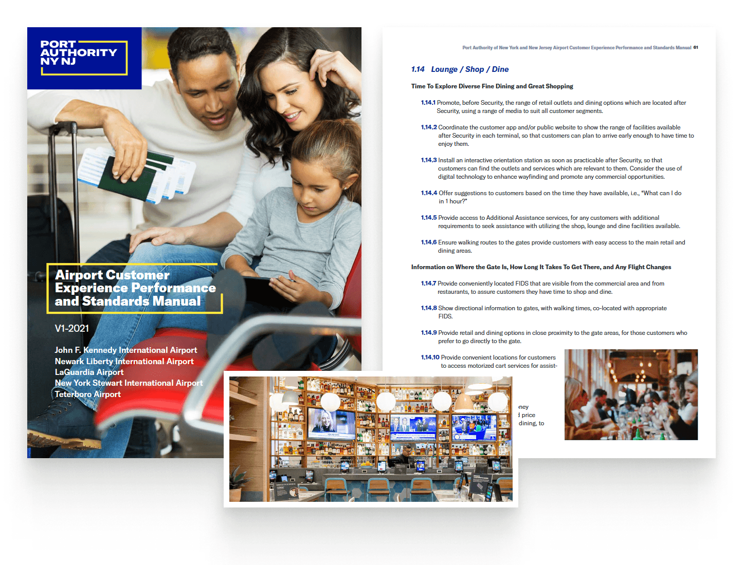
While I did end up reading most of it, there’s simply too much valuable CX data in it, so I leveraged AI to help me with analysis for our specific use case. My initial ChatGPT+ prompt was as follows:
I need you to parse through this PDF and then create a spreadsheet for me that builds personas and details about those personas covering these elements: demographic details, goals, pain points, behaviors, and preferences. The goal of this is to better define personas for travelers stopping to shop, eat/drink, relax and socialize in a new golf simulator bar in an airport. Please be as detailed as possible as this is a 168 page PDF with a lot of great information. Please think before you respond. The reply should be a table with the elements mentioned and if the preferences fall into categories, make a column for those categories. You can use nested cells or sub-cells.
This gave me the basics of the main persona groups which I then populated into a FigJam board as seen below. Talking further with ChatGPT and actual stakeholder interviews (the CEO in this case acted as “Voice of the Customer”), I began populating the board with everything from Goals to Pain Points, Behaviors, Preferences, Activities. I added an additional “Retail Brand Preferences” to identify similar brands based on the personas. At this stage, we were not yet targeting golf or even athletic brands, but emotionally aligned ones like L’Occitane, Anker, Theory, and Eagle Creek.
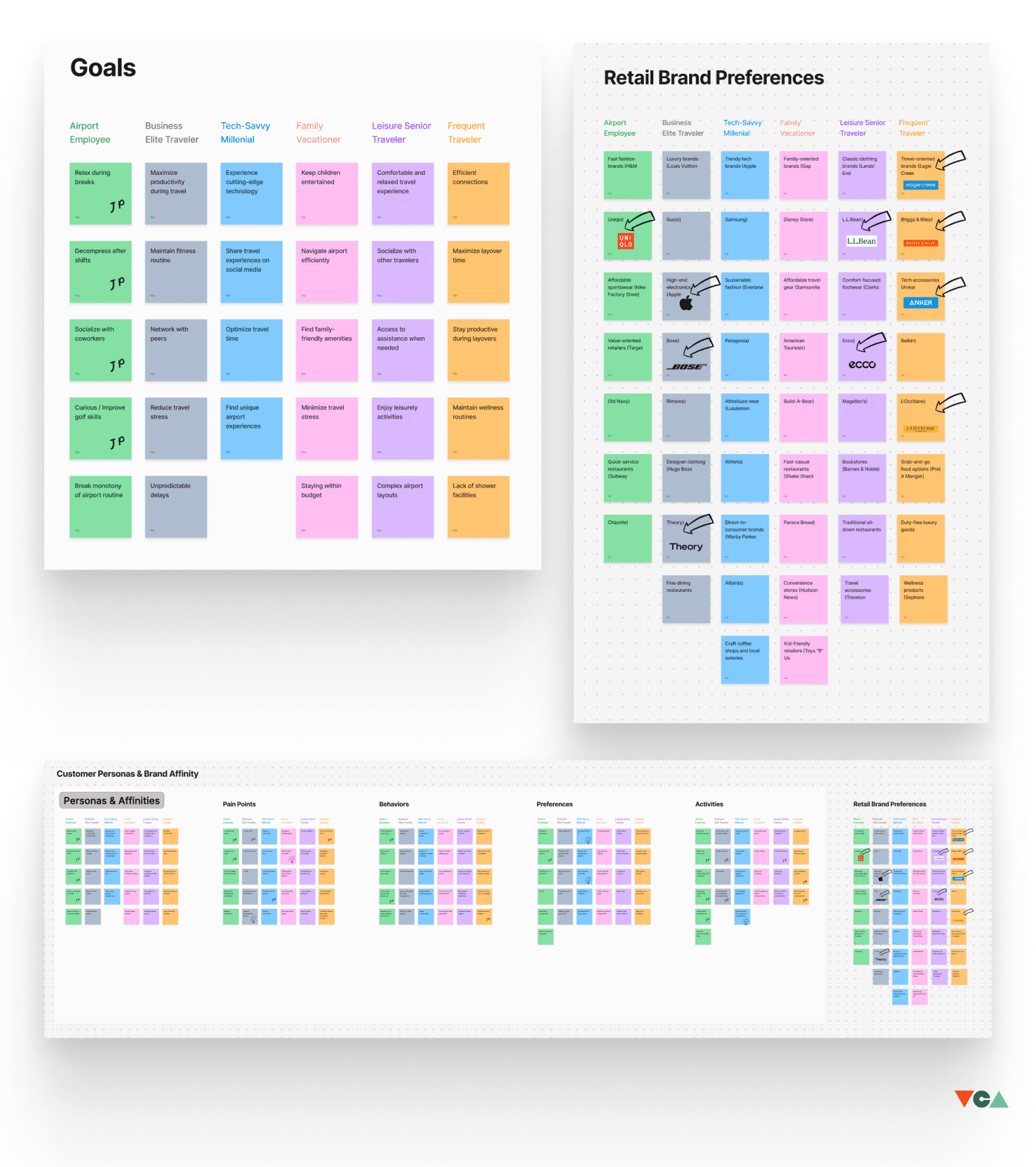
Affinity Mapping & Customer Persona Building
At this point, we began an activity involving human participants — especially stakeholders — and AI-derived data to combine customer personas and brand affinities with the qualities Golf DEN wanted to align with, both generally and within the golf industry specifically. Golf DEN is all about bringing diversity and a more accessible vision to golf, so brands like Malbon and Bad Birdie were much more aligned than the more “stuffy” brands built in the 20th century.

Golf brands that aligned closely with Golf DEN’s vision - Their vibes, why they’re successful, and overall sentiment around their brands.
Problem Statements - For content strategy, CTAs, and overall art direction
In order to help build problem statements, I went to Claude AI Professional Plan. Referencing a lot of the aforementioned work in FigJam with both human and AI input, I prompted it with:
I need you to help me synthesize a set of personas and their affinities from the attached files. My goal here is to develop 5-7 solid problem statements to build the content strategy around a new golf simulator bar inside an airport that caters to a diverse mix of airport employees, frequent travelers, business elite, and tech-savvy millennials. Your responses should be derived primarily from the PDF attached but you may use some industry knowledge as well. Be sure to also derive inspiration from the second image on "Accessible 'Everyman' Golf Brands" which is based on currently existing brands and their personas. Determine how to merge the personas into these 5-7 problem statements and not keep them separate. The problem statements should be 1-2 sentences each.

The problem statements should include: * The collective group experiencing the problem * The key pain point or challenge they face * A hint at the desired outcome and why they should experience a bar/restaurant with a golf simulator feature inside an airport

Please think before you respond.
The problem statements for specific personas we landed on:
Time-stressed travelers and airport employees struggle to find engaging, stress-relieving activities during short breaks or layovers, seeking a unique experience that allows them to decompress quickly while maximizing their limited time.
Business elite and frequent travelers face challenges in maintaining their wellness routines and finding networking opportunities during travel, desiring a space that combines physical activity, social interaction, and a touch of luxury in the airport environment.
Tech-savvy millennials and younger professionals crave novel, shareable experiences in airports to break the monotony of travel, looking for an entertainment option that's both trendy and allows them to improve their skills or try something new.
Diverse groups of travelers, from families to solo adventurers, find it difficult to discover common ground for socializing or entertainment in airports, needing a versatile space that caters to various skill levels and interests while fostering a sense of community.
Airport employees and frequent travelers dealing with irregular schedules and high-stress environments lack accessible, affordable options for unwinding and socializing with peers, seeking a familiar yet exciting venue that accommodates their unique work-life balance needs.
These problem statements not only solidified the varying persona groups, but also addressed the key challenges for each persona, how a golf sim bar could provide stress relief, networking opportunities, new golfing experiences for beginners, and even time optimization and community building for airport employees.
The Brand
Inspiration
This where the fun begins. As a UX engineer, I chose the following tools to begin collecting inspiration, Eagle being my favorite new tool. It’s like Pinterest but better organization and none of the noise. For searching, I actually ensure as best as possible that AI-generated content is not included. This is a crucial differentiator when it comes to creative work and inspiration and I’ll write another article about this soon, but basically if I search for “relaxing lounge,” I don’t want a bunch of Midjourney results (I do love Midjourney). I want real, actual photographs or human creations. Most stock sites now include this feature to exclude AI content and I highly recommend using it at this stage. Some of the search terms I used based on all of the affinity mapping and persona building included: relax, focus, relax campfire, everyman, vintage golf, modern sports, travel, diverse sports, etc. For website inspiration, I also used Mobbin, an awesome tool for UI inspiration.
The atmosphere and more rugged nature of a campfire mixed with the comforts of “glamping” really stuck with me as a setting that aligned with this brand and it ultimately drove a lot of the color and typographic decisions I made.

Eagle UI showing inspiration for brands, emotions, and imagery tied to the newly developed personas for Golf DEN
The colors
Using some of the inspiration from above and multiple color tools I leverage, we developed the following final color palette for the brand and all digital assets.
I’m a bit of a nutjob when it comes to color theory and have a regular toolbox for color inspiration and even the science behind color through tools like huetone.ardov.me, farbvelo.elastiq.ch, Adobe Colors, and my favorite one for collecting and organizing, Coolors.co.

Final color palette and some of the explorations and tools like Coolors.co
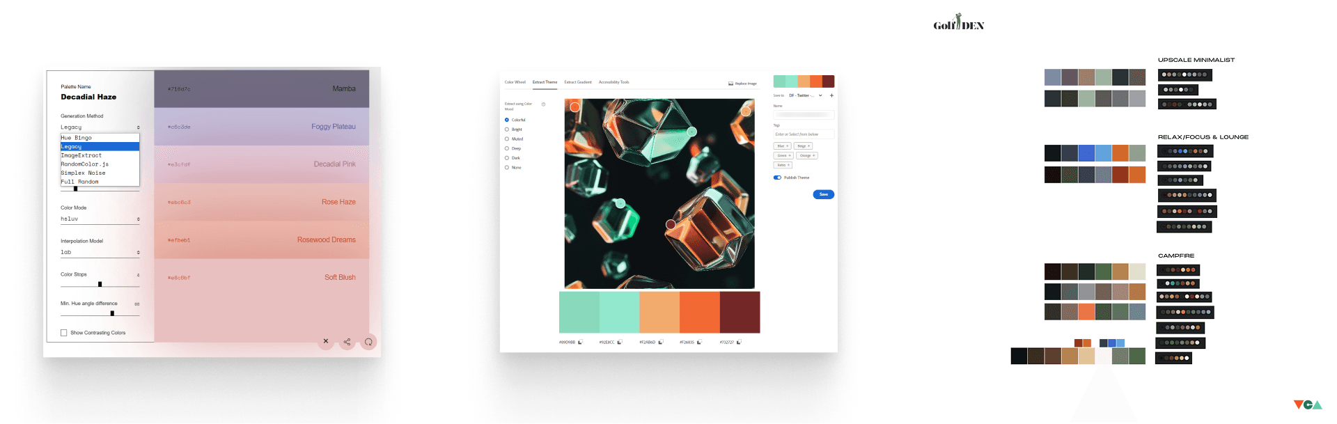
Additional color exploration. On some projects, I don’t use nearly as many color tools, but like I said, I’m a color maniac.
The typography
Typography is one of the most critical and often overlooked, misunderstood elements of excellent UI and design work in general. For a brand, it needs to capture the emotional and aesthetic nature of both the company, its services, and appeal to its customers. So many designers in recent years follow trend and choose easy go-tos like Helvetica, Inter, and Georgia simply because they’re everywhere (and for good reason. See “Helvetica” on Netflix). Instead, I chose to look at inspiration from our branding exercises and everything I gathered IRL and digitally in Eagle and my camera roll.
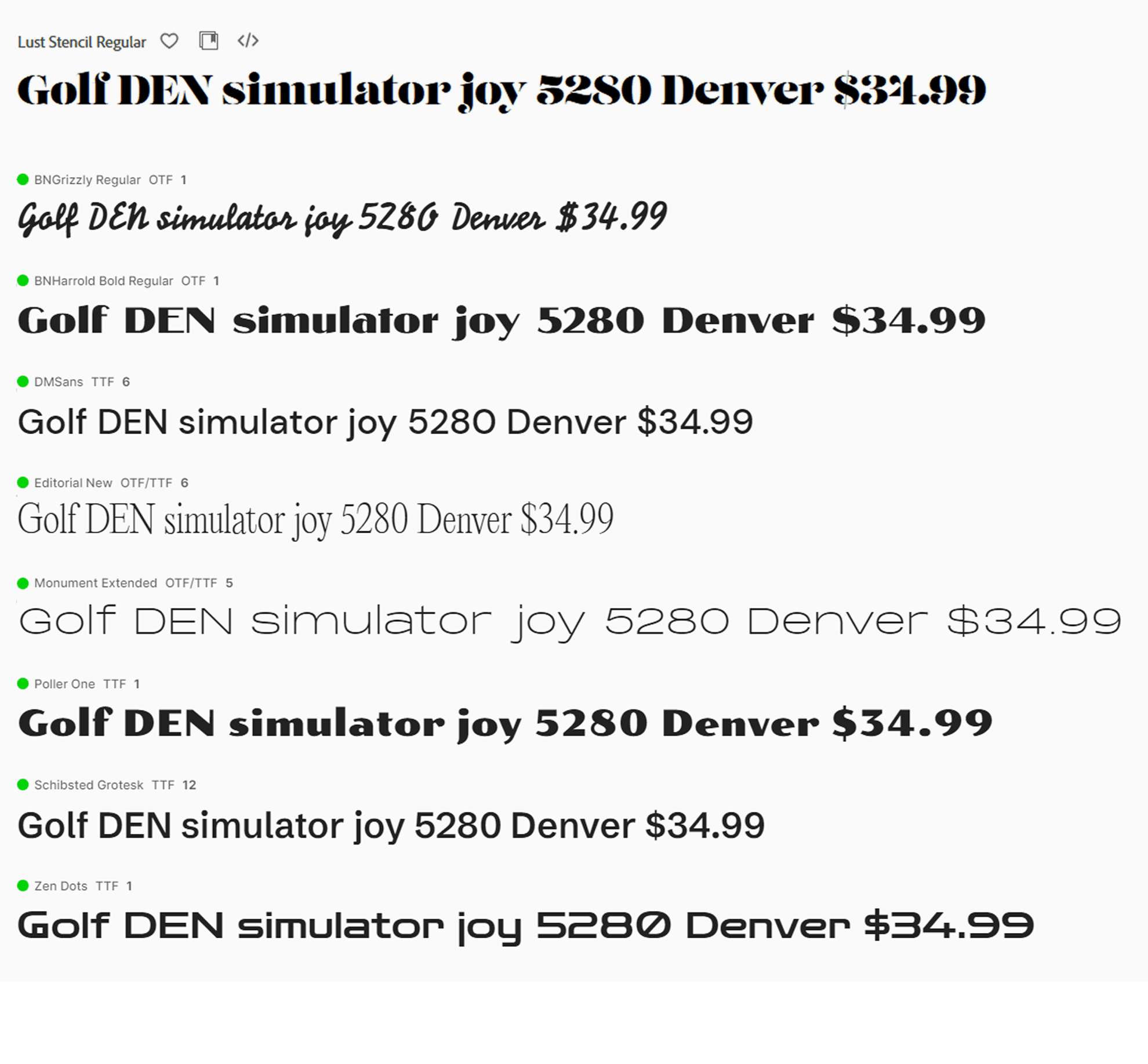
The fonts I chose for the two final major directions are as follows:
Vintage, mid-20th century liquor labeling design
BN Grizzly (paid) - by Brandon Nickerson. I absolutely love his type lockups and have bought quite a few of this fonts. This man understands vintage typography like no other. This is the script “Golf” in the first logo below.
Poller One (free) - by Yvonne Schüttler, Google Fonts. This is the “DEN” in the green/white vintage logo.
Monument Extended (paid) - Pangram Pangram. One of my favorite foundries. Just used as the super wide sans-serif “EST. 2024” in the vintage logo.
More contemporary, dark-mode logotype adhering to Golf DEN beer labeling
Lust Stencil (paid/Adobe) - Neil Summerour. From Positype.
Schibsted Grotesk (free) - Used primarily for headings and body copy on the final UI. Designed by Bakken & Bæck, Henrik Kongsvoll
Editorial New (paid) - Also Pangram Pangram. Also a trendy serif font as of late, but its quite lovely if spaced and weighted properly.
Logo explorations
Now that we have the overall look-and-feel from colors and typography, it was time to begin sketching, which you’ll see below the final logos shown below.
Design 1 - Vintage liquor labeling logo
This logo called to mind both vintage liquor labeling as well as traditional country club branding. The horses in this logo a nod to the notorious “Blucifer” statue at Denver International Airport.
Design 2a - The “everyman” logo
This design much more simplified than the first logo leverages popular athletic leagues outside golf while utilizing the energetic, almost dramatic “Lust” stencil font that has come back as a popular retro serif logotype. This style worked great as a dark mode, with the colors really popping and accentuating the man and the typographic shapes.
Design 2b - The “GD” badge logo
A simple variation on the everyman logo, this design is a lockup of a “G” and a “D” with a small period or dot representing a golf ball or the cup (the hole on the putting green). The client may still use this for some merchandise.

Showing the three final logos. The client ultimately went with Design 2A.

Early sketches I did both in pen/pencil and on iPad in ProCreate app.
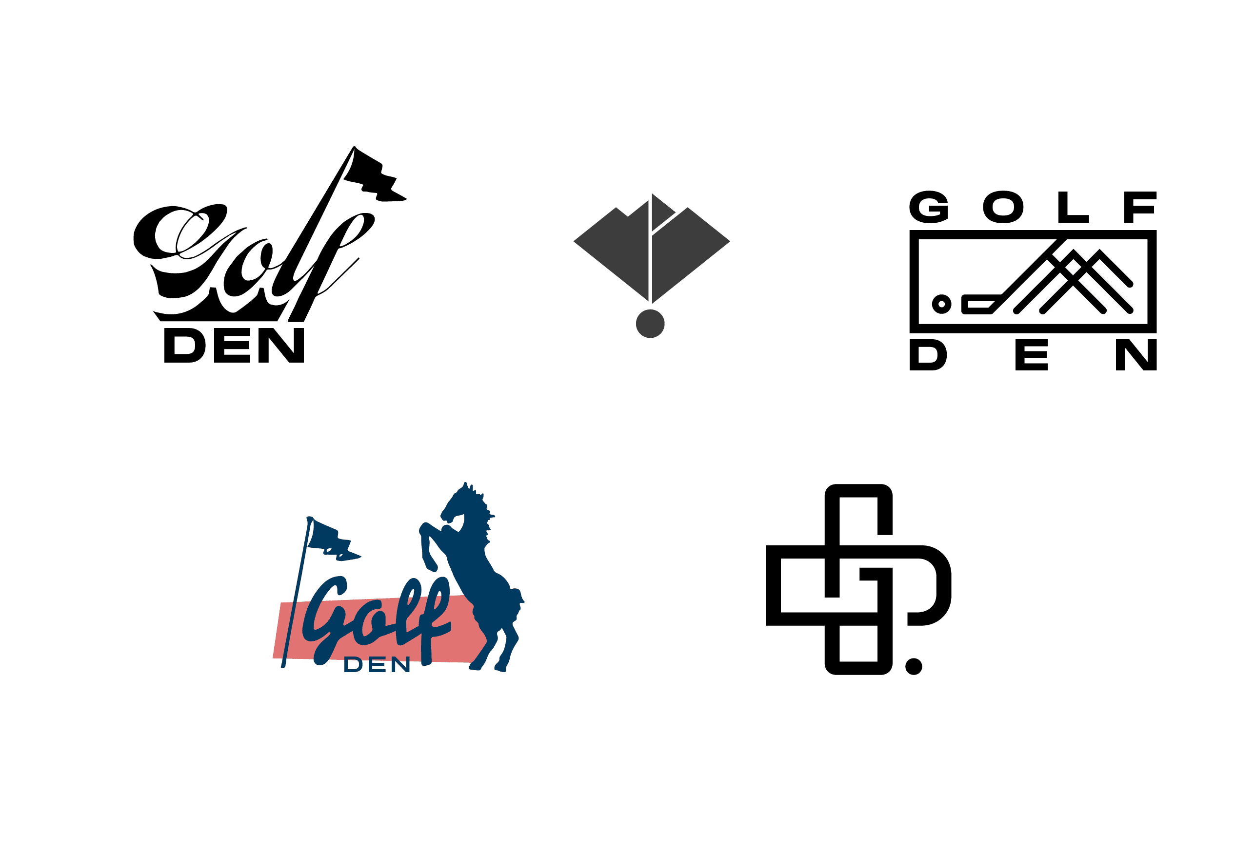
Some of the alternate logos that didn’t make the final cut.
The brand guidelines
I actually provided the brand guidelines well after launch and our initial social media campaign, but for the sake of this case study, I’ll describe what was included here. The goal of these guidelines is to provide clear guardrails and art direction guidance for other agencies, groups at the airport, and the client himself to properly use the newly developed type system, color palette, and dark and light mode logo treatments. The final output is a 23-page PDF that is also available online and I’ll update this article with the link soon. The more robust branding guidelines I provide also include imagery guidelines, layout, and grid systems.

The 23-page brand identity guidelines for Golf DEN
The website
I developed this site using Square Online as the client’s entire physical business is also run using Square, the widely popular point-of-sale (POS) technology you see at most coffee and retail shops. The seamless integration of Square Online and the actual golf simulator bar at DIA airport is quite impressive. The site was the most challenging part of the project mostly due to the limitations I had working within Square Online, but platforms today should never keep a designer/developer from building out a great customer experience. You simply have to work with what you’ve got and I say this as someone who designed his first site, as the kids today would say, “in the late 1900s.”
While Square Online doesn't support fully custom themes in the way platforms like Webflow or Framer do, it offers around 30 professionally designed templates that can be tailored to fit a lot of needs. The native components are somewhat limited compared to more open-ended platforms, but the ability to embed custom code allowed me to extend the functionality and design beyond the default options. This flexibility made it possible to bring a more bespoke experience to life within Square’s ecosystem.

The 27 or so templates available on Square Online.
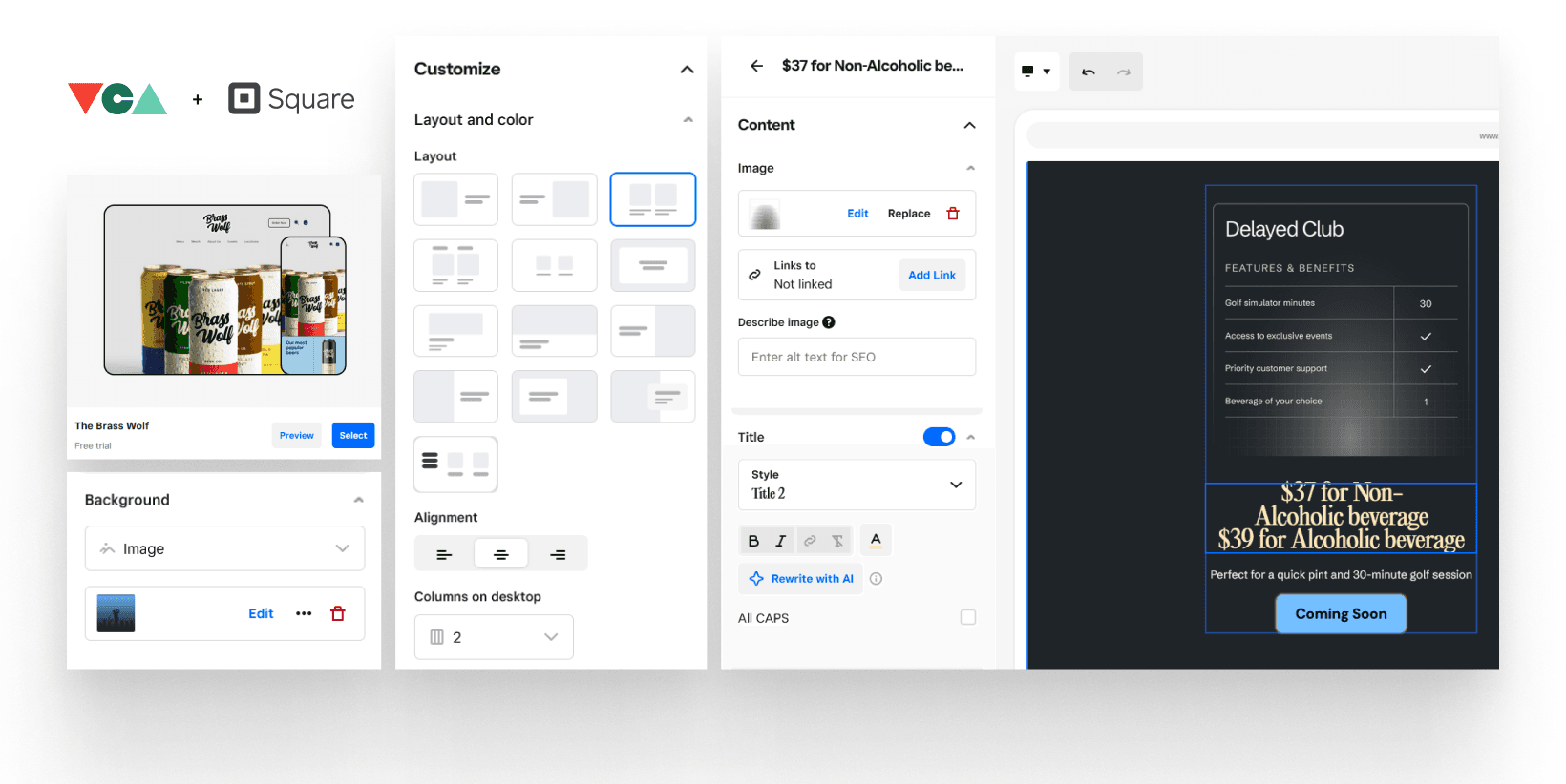
Showing some of the very basic UI capabilities of Square Online. And just a small sample of the building blocks I used from the Figma design, able to leverage a lot of background and CSS styling inside Square Online:

Some of the component work I did in Figma prepping for development in Square Online.
We went through multiple online reservation vendors that would allow us to keep customers inside golf-den.com (several wanted us to use pop-up windows or new tabs, which is not good UX), finally landing on a solution called Whoosh. In order for some of the embedded buttons to work inside Square Online's limitations, I did end up having to write some JavaScript, CSS and HTML which I cross-checked with ChatGPT. Yes, actual vibe coding.
The design
For this specific project, I went almost immediately into high-fidelity designs. While wireframing can be very beneficial especially on larger, enterprise SaaS platforms, apps that utilize a lot of data like ERPs and the work I did at Oracle NetSuite, many UX engineers like myself are going straight to hi-fi. I’m even finding myself occasionally building directly in Framer now and foregoing Figma entirely.
Utilizing all of the prior inspiration and customer empathy, I designed two totally separate variations - one in the vintage country club style and one in the “dark mode” more modern approach.
A quick UI motion mockup of design variation 1 for mobile.

The full desktop layout for design variation 1. If you look closely, you can see DIA airports iconic white rooftops.

The final version which the client chose was the dark one utilizing the awesome illustrations by Urban Nerds Studio, the Editorial New serif typeface which paired well with the Schibsted Grotesk font.
Landing and Home Page best practices for conversion
Following our industries best practices for landing pages, I used the following outline for increased engagement and ultimately great conversion rates for airline passengers to airport employees booking time through golf-den.com
1. Research First, Write Second
The foundation of a high-performing landing page is understanding your users. Using the previous market research, competitor analysis, and stakeholder interviews, I uncovered what prospective customers care about most. Letting words guide copy—especially in headlines and benefits.
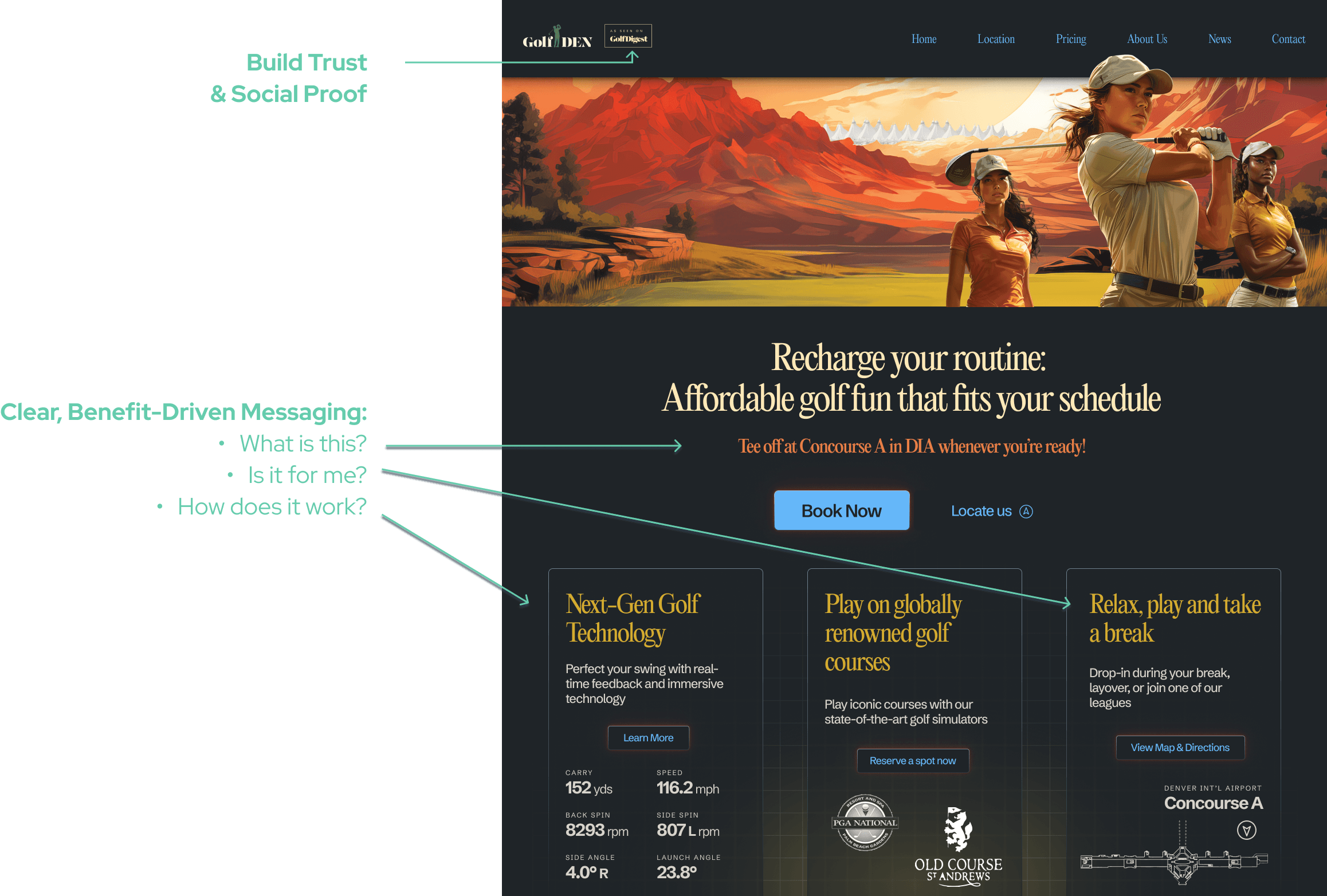
2. Craft Clear, Benefit-Driven Messaging
I needed to be specific and focus on how Golf DEN actually helps or benefits travelers and airport employees, written like we're answering their most pressing questions or desires (i.e. break time after a Delta shift or a family of three on a long layover). Treat it the landing page like a conversation or FAQ:
What is this?
Is it for me?
How does it work?
Why should I care?
3. Design a Focused Hero Section That Converts
The hero section needed to immediately communicate value with a strong headline, visual, and a clear CTA. Simple, clean, enough whitespace, and plenty of those beautiful illustrations.
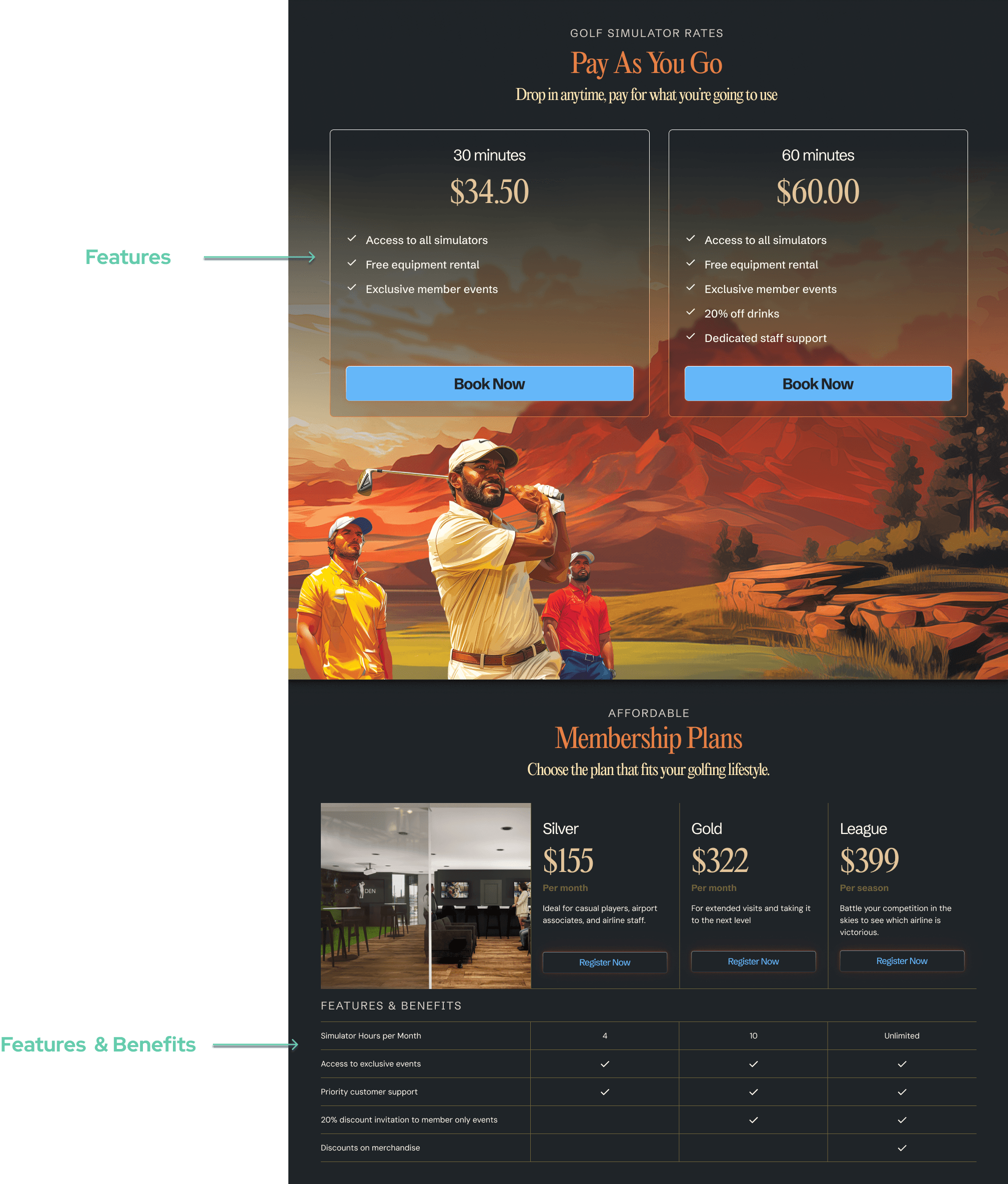
4. Show the Value Visually
Breaking the info further down the page into columns also helps with legibility. I combined feature breakdowns and benefit sections while also providing active CTAs throughout
5. Add Proof and Build Trust
This is still TBD on the site and something we hope to add soon, but it’s all about social proof—testimonials and reviews to let others validate Golf DEN. Building trust by using clear headings, consistent design elements, and smooth transitions between sections as they read.

6. Optimize the Experience (and the Page)
Speed and clarity are non-negotiables, especially for travelers who may not have time to even hop on DIA’s free WiFi. There is a lot of imagery on the site, but we intentionally did not include any video on the homepage to enhance performance. Things like the live Google Map offers too many benefits to not include it, eventhough it does increase the page size some (still awaiting Google listing to go live so the actual location on Mezzanine of Concourse A is even more helpful).

The tagline
A hero tagline being the most important part of a marketing site like this, I continued to use Claude and some of my own ideas, landing on the following options for the homepage and its primary call-to-action (CTA).

We ended up running with the last one “Recharge your routine: Affordable golf fun that fits your unique schedule - Tee off whenever you need a break!” There are plans to A/B test all of these and continually improve.
Social Media Design & Strategy
"…an increase of 2,1377% page views and more than a 3,000% increase in unique visits to golf-den.com via VCA social media strategy…"
Now that we had the site developed and working, it was time to start building out all of the social media presence. As this wasn’t an open-ended, subscription contract but a fixed-rate, we agreed upon me delivering roughly roughly one month of content. It included Facebook, Instagram, Twitter, LinkedIn, TikTok, and Pinterest. SnapChat is planned but will require more on-site content creation by the Golf DEN staff. Initially the client indicated they had a social media hire, but as this ended up not being the case, I also handled all of the submissions of the content and even set up some of their profile pages.

On-going updates or creation of new ads based on things like click-through rate (CTR) were not included and would have incurred additional time-and-materials cost, but as you can see in the metrics below, it was clear my social marketing efforts paid off. The month that I provided this social media content which included strategic tagging and keywords, linking to the new website, we saw an increase of 2,1377% page views and more than a 3,000% increase in unique visits to golf-den.com via VCA social media strategy compared to the first month post-launch.
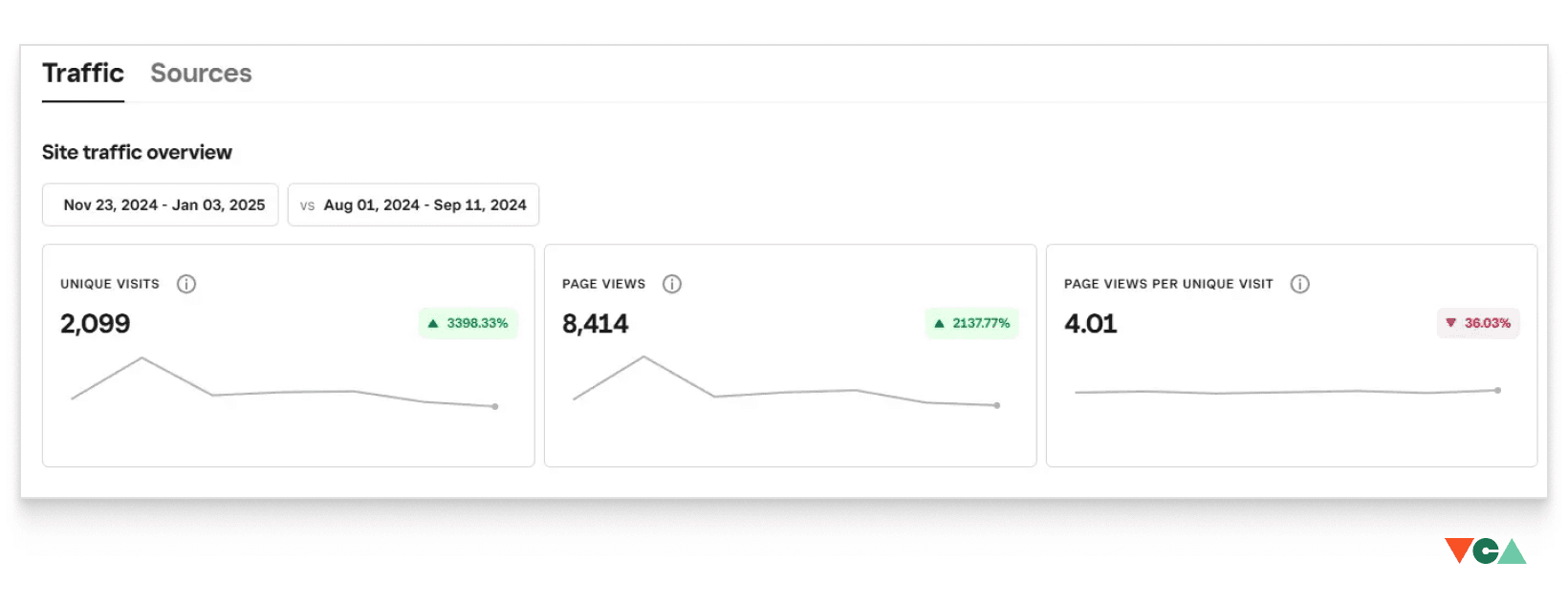
Analytics from Square Online for the Thanksgiving/Christmas 2024 holiday season


